Ericsson
While at Velocity, I was asked to work on a interactive digital piece for Ericsson for Mobile world conference. The piece was to be installed into the future of 5G area of the Ericsson booth for visitors to view while waiting to try the Mixed Reality experience powered 5G and other stakeholders such as Intel, Warner Brothers, USC, AT&T as well as Ericsson. Working with a copywriter, we began to research and deep dive into the experience, to try and piece together a story for the visitor to view and learn more about the capabilities of 5G.
Experiential Design
UX/UI Design
Art direction

Working with a copywriter, we began to research and deep dive into the experience, to try and piece together a story for the visitor to view and learn more about the capabilities of 5G. I set out the content and journey in the form of an Information Architecture and then proceeded to flow in draft copy and sketched visuals into wireframes so the client could get an understanding of our vision.


Once we presented the wireframes and got the client on board with the journey I then began to design the pages and work in the content so the Mixed Reality story could be broken down to make sense to the visitor and to allow each element in the process had their moment to shine.

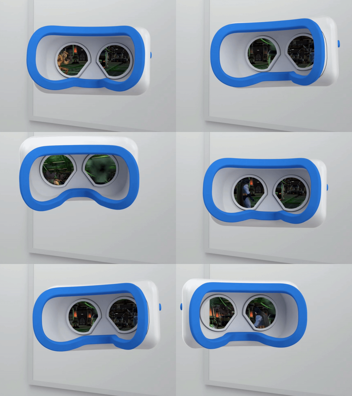
When the team and client were happy with the UI design, I then worked alongside a CGI artist as an Art Director to build each seen and model them up. Once we were happy with the look and feel, I could then get the vision of how each scene would animate and be brought to life. The main thread between each scene was the 5G wave, so this had to be consistent and have the right movement to it. We regularly brought in the Design Director to help us get the right aesthetic for each segment.

Dark Mode
After the event, the client came back to us to say it was really well received, though they wanted to add more interactivity, as well as to streamline the journey to concentrate on certain elements as well as to add more to the site from the event. We were also asked to keep the CGI elements, but to update the look and feel.
After mocking some up some ideas, I remembered when the CGI artist and I explored a dark version of the renders previously in the beginning of the project, but decided the light mode matched the look and feel the client was after for the event.
I then mocked up some designs based on that dark mode, using layered rendered we previously used with current and updated UI to present to the client. Luckily the client was instantly sold into the dark mode and also liked our vision for updating the style and flow for the new site.
Feel free to see the site